Live Action TrendLens User Sessions – Live from Bethesda!
Has Vehicle Miles Traveled (VMT) been affected by recent fluctuations in the price of gas?
Last week we hosted our first “Office Hours” session for TrendLensTM users. During our inaugural roundtable discussion, we looked at different ways to compare data sets to tease out trends.
One conversation driver is the impact of the war in Ukraine
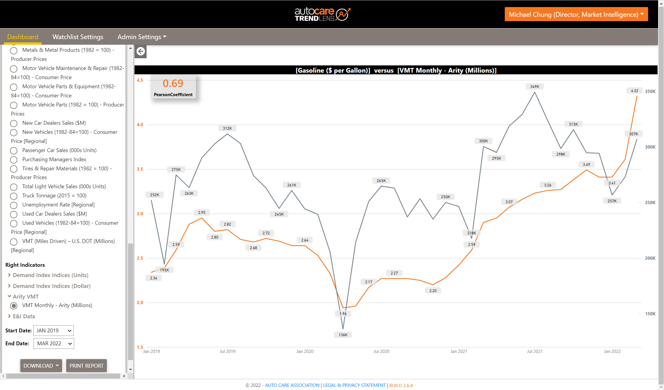
– whether increases in U.S. gas prices have impacted VMT, and thus the aftermarket. In the figure below we use the Trends Comparison tool to compare the price of gasoline to Arity VMT for the period January 2019 – March 2022.Figure 1: Price of Gasoline ($/gal) vs. Arity VMT, January 2019 – March 2022
Source: TrendLensTM [Within the TrendLens platform, select the “Economic and Industry Indicators” report section > select the “Trends Comparison” report > from the menu under Left Indicators choose “E&I Data” > then select “Gasoline ($ per Gallon)” > from the menu under Right Indicators choose “Arity VMT” > then select “VMT Monthly – Arity (Millions)” > set the Start Date to “Jan 2019” > set the End Date to “Mar 2022”. ]
Note the sharp increases in both at the far right – this is for January – March 2022. Arity data are available from January 2019, and the high positive correlation between these two variables, 0.69 (in upper left of screen capture), may seem counterintuitive. After all, one might expect VMT to decrease when gas prices increase, right?
We see that in a longer view of VMT data – look at the next figure:
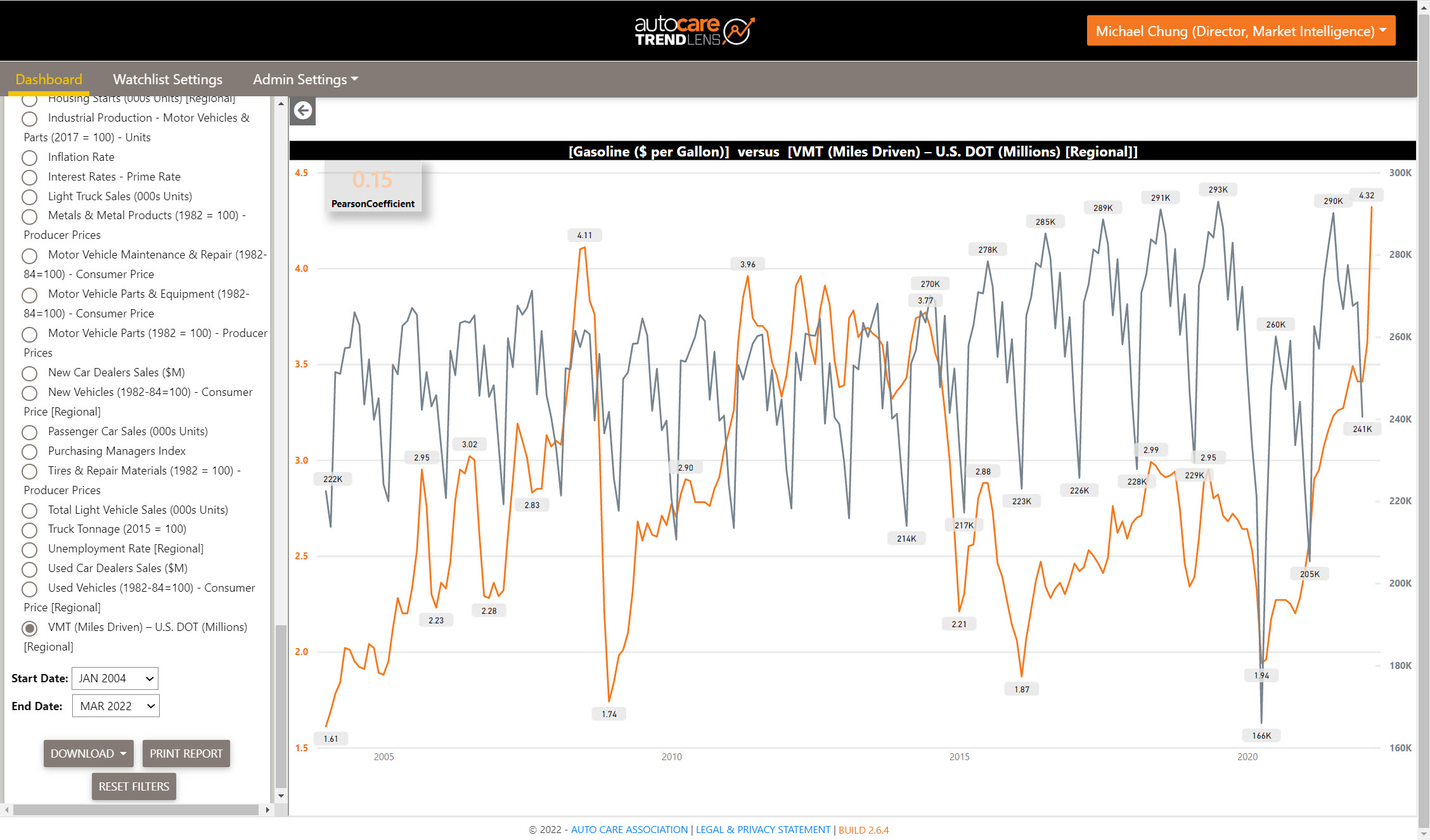
Figure 2: Price of Gasoline ($/gal) vs. USDOT VMT, January 2004 – March 2022
Source: TrendLensTM [Within the TrendLens platform, select the “Economic and Industry Indicators” report section > select the “Trends Comparison” report > from the menu under Left Indicators choose “E&I Data” > then select “Gasoline ($ per Gallon)” > from the menu under Right Indicators choose “E&I Data”> then select “VMT (Miles Driven) – U.S. DOT” > set the Start Date to “Jan 2004” > set the End Date to “Mar 2022”. ]
Here we compare USDOT VMT to gas prices from January 2004 to January 2022 (the most recent date for USDOT VMT). With the longer history (including the 2008 Great Recession), we see the relatively cyclical nature of VMT (except for 1Q2020 as the COVID-19 pandemic significantly reduced driving) and a more inverse relationship from 2014-2016, resulting in a Pearson Correlation Coefficient of 0.15 (upper left).
It’s worth keeping the following in mind:
- Strength in numbers: The larger the sample size, the higher the statistical confidence. The Pearson Correlation Coefficient is calculated for all data in our TrendLensTM database, irrespective of the start/end dates selected – most Economic and Industry Indicator data is available from 2004.
- Correlation does not imply causation: Remember that just because two variables are highly correlated (positively or negatively), it doesn’t mean that one follows the other. Other variables may be at play.
As a reminder, TrendLensTM won’t tell you what to do or pretend to solve the problem. Rather, the platform provides views of industry and economic data to guide users’ strategic and operational planning. We at Auto Care aggregate and present what we have identified as salient, relevant data. Let us know if you have suggestions for data series – your feedback helps us to build a better data product and we have incorporated updates and introduced new features (e.g., Arity VMT, regional data, Pearson correlation coefficient) along the way.
Future Sessions – Join Us!
We’d love for TrendLensTM and Demand Index users to join a future “Office Hours” session. We plan to use the same framework – a short lesson on various features of the platform and a round-robin discussion on topics like the business questions you typically solve, different approaches and resources, and associated challenges and limitations folks run into.
In our first session, we had more than a dozen TrendLensTM users join and we gained some interesting insights on the different ways our members compare data. For example, using a double y-axis chart is a nice way to compare two different indicators, but the scaling of the axes can influence one’s initial interpretation of possible correlation.
On the other hand, plotting two variables on a single X-Y graph and conducting regression analysis can help identify a possible relationship between the variables, whether linear, multiple, etc. and remove the time component.
We plan to host future sessions on these topics – keep an eye out for the next one or click here to receive more information as we schedule the next one.

Welcome to the new YANG Effect! Your one-stop quarterly newsletter for all things Automotive Aftermarket contributed to and written by under-40 industry professionals.
More posts

Market Insights with Mike is a series presented by the Auto Care Association's Director of Market Intelligence, Mike Chung, that is dedicated to analyzing market-influencing trends as they happen and their potential effects on your business and the auto care industry.
More posts

 click to enlarge
 click to enlarge